Understanding the plots
The Energy Balance Plot
The HeyrexVet Energy balance plot compares the amount of calories fed per week with the calculated calories burned, based on their activity levels.
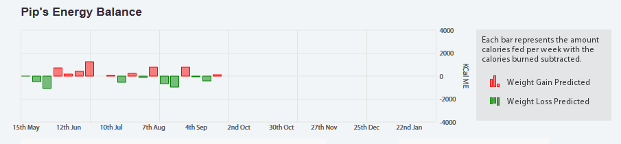
- Weeks where they have eaten more calories than they've burned are indicated by a red bar in the top half of the graph. A weight gain would have been expected this week.
- Weeks where they have eaten less calories than they've burned are indicated by a green bar in the bottom half of the graph. A weight loss would have been expected this week.