Understanding the plots
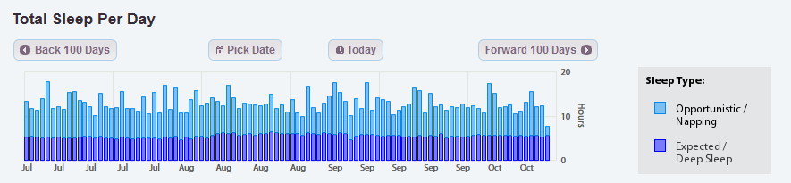
Total Sleep Per Day
The total sleep per day graph is a simple stacked bar graph.
- Each bar on the graph shows you the total hours your patient spent sleeping in a single day.
- The dark blue portion of each bar is the time spent sleeping in their normal/expected sleep periods
- The light blue portion is the time spent napping each day.
- You can hover your mouse over each bar to find the date and the exact time in each type of sleep.
- This graph automatically shows the most recent 100 days of sleep data. You can navigate backwards and forwards through this data by clicking the buttons above the graph.